2009年3月28日 星期六

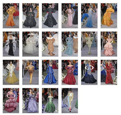
2008 Spring Couture

I think this is one of the most exaggrated collections of John Galliano. This collection featured a lot of details, especially the lamp-shaped skirt and the saucer hats (actually, I think its shape like a UFO). Besides, the decoration of the dress, sparkle and paillettes, make the collection more glamorurs.

This collection is quite rich in colour. Nearly all colour in the colour wheel had been used. But the most eye catching one should be green, purple and orange which is in triad colour. Overall, most of it have similar value as they are tend to high value. So the collection is still cohesive even it contains a wide range of colourm Part of it, especially yellow and green, are outstanding from the whole collection as they are bright.

2009年3月27日 星期五

Colour forcasting

Information from fashiontrendsetter.com


The Color Trends for Autumn/Winter 2009/2010 Season

--Seizing on color as a power source to jolt colorful tensions.
--Maintaining equal pressure on liveliness and neutrality and encouraging luminosity.
--Heightening intensity, and circulating energy in a positive, rippling or alternating current


CHIC_This trend is dominated by solid and cold tones. Midnight blues and earth tones as well as deep pink are opposing and in that way creating a world of playful patterns.

CLASSIC_characterized by diluted color effects. Clean and earthy colors play a big role in this section. Brown and green tones mixed together create a hint of mystery in combination with gray and foggy shades
CAUSAL_Juicy orange tones, drunken scarlets and neutral nuances combine in a dangerous relation. The way how a dynamic brilliance and shining is created seems like a magic formula. Pavement grays brought together with dazzling lights are a contrast to passionate and theatrical tones.

2009年3月23日 星期一

Fall Couture 2007


This collection is different from his more familiar roaring theatrics and it drew romance and delicacy. John Galliano aprroached "the New Look" through the artistic landscape in this collection.

This two pieces' design were based on "the New Look". The first one is thr black "Bar" suit and the second one is an ivory circle-skirted dress.
The sequence of displaying the collection ravishing. From the clothes at lower value, and then appeared to shade from one hue to another.


There is a significant contrast between this 2 intensity. This sequence based on the harmony of colour, as it gave a enough variety of for interest and use of colour (RED, BLUE and ORNAGE) is a split complementary colour which can draw attention.

2009年3月20日 星期五

Magazine and Fashion

For us, especially teenagers, magazine is an important mass media for us to get in touch with fashion and so we can know the lastest trend of the fashion industry.
In Hong Kong, not only the local magazine, foregin magazine may affect the general trend in Hong Kong. So in the post, I would analyse how it affect the trend in Hong Kong!

Japanese culture make a significant impact on the trend of HK. The recommend in the Japanese magazine may always bring about a upsurge in HK.

(From Nonno)
For example, this kind of boots is one of the hottest items in the winter of 2008. You can see a lot of teenagers wearing this boots in Causeway Bay and Mongkok.


(From more) (From Nonno)
Tarten became one the hottest pattern in summer of 2008 again. As the items of tartan was showed in the collection of D&G, Marc by Marc Jacobs, tartan bring about a upsurge again. Many local and foreign magazines had introduced the item of tartan.


Not only Christian Dior,Marc by Marc Jacobs, etc used purple to be the main colour of their collection. As a result, purple becoame the most popular colour in spring 2008. Many magazines recommend the items in purple colour.

General public may not always know and follow the trend of high-fashion. However, the report of the magazine make it familiar to the public. That's why the influence of fashion magazine is important!

2009年3月17日 星期二

Classwork 2


The shops' colour of the background is quite important as it can impress customers and attract them to enter your shop. For me, I have designed a contrast of colour for the shop. Yellow can give people a feeling of freshness and clean, and purple can give people a feeling of glamorous and nobleness. Using this 2 colous together must be attractive for customers.

Couture fall 2006


The theme of this collection is the a parade of medieval warrior-women. Some of the clothes are exactlly match with the theme.

Gold, black and copper can represent the braveness of warrior-women, together with the accessaries of diadems, equipped with an armored sleeve further emphasize the theme.

Purple, red and pea-green are the outstanding colour from the whole collection. The design of clothes is not plain in colour. Instead, John Galliano used two colours in part of the collection

For these 2 pieces, the colour is in anologic colour scheme, as the value of them are similiar, the clothes are still look harmonic with such colour combination.

But the colour combination of some clothes are in a complementary or split complementary colour. (Red & Green, Yellow, Purple and Green). Those combination are based on the principle of novelty as using unexpected hues in the same clothes cam draw attention to people.

2009年3月13日 星期五

2006 Spring Couture


For the Courture Collection of John Galliano , I discovered that he seldom focus on a specific colour. However,for this collection, the major colour is RED obviously.
The idea of John Galliano came form the rioting in Frnace and he make an association idea of Revolution. This is a blood-and gore-spattered drama of him.
No matter the colour of the clothes, or colour of the background, or colour spotlight, all of them are cohesive with the theme "Revolutionary".

Obviously, this collection is in emphasis of colour_RED! Every pieces contain the element of red, together with the decoration and background scene. This collection is an emphasis of colour as the whole collection is in the same hue.

Besides, this collection is based on the principle of resemblance since the colour difference between them is less. In order to coordinate with the theme of Revolution, the RED is partial toward dark. As colours are from an analogous color scheme, colours of the collection is harmonize.

2009年3月6日 星期五

Classwork 3


Monocromatic Colour Scheme

Analogic Colour Scheme

Complimentary Coulour Scheme

Complimentary Colour Scheme

Monocromatic colour Scheme

Analogic Colour Scheme